Choosing the Perfect Font for Movie Poster Credits
When it comes to the visual storytelling of cinema, there’s a hidden language that plays a crucial role behind the scenes. Every element in a production, from the vibrant images to the subtle audio cues, contributes to the narrative. Among these aspects, the choice of typography stands out, particularly in the segment that acknowledges the talents behind a film’s creation. It’s an art that requires a keen eye for detail and an understanding of how different styles communicate emotions and messages.
Imagine walking past a display of your favorite films. What catches your attention? Often, it’s the elegant lettering that draws the eye and sets the tone even before the first scene unfolds. The typography used to highlight the team’s hard work can evoke a sense of nostalgia, drama, or excitement. Selecting the right style is not just about aesthetics; it’s about enhancing the overall experience of the audience and honoring the creators.
In this exploration, we’ll delve into the nuances of choosing the right typographic styles for honoring contributions in the cinematic realm. From bold and modern to classic and elegant, each choice tells a different story and conveys unique emotions. Let’s embark on this journey to discover how the right lettering can leave a lasting impression long after the credits roll.
Choosing the Right Typeface for Acknowledgments
Selecting the ideal typeface is a crucial step in the design process, especially when it comes to showcasing the essential names behind a production. A well-considered selection can enhance readability and contribute to the overall aesthetic. Let’s dive into some key points to consider when making this decision.
Here’s what to keep in mind:
- Legibility: Ensure that the text is easy to read from a distance. Avoid overly intricate styles that might confuse viewers.
- Size Matters: Choose a size that stands out without overwhelming the visual elements. Balance is key.
- Style Cohesion: The lettering should complement the overall theme of the production, whether it’s dramatic, light-hearted, or something in between.
- Hierarchy: Differentiate between various roles and contributions. Use variations in weight or size to guide the viewer’s eye.
- Timeless vs. Trendy: Consider whether you want something classic that will stand the test of time or a trendy choice that might feel outdated quickly.
By pondering these aspects, you can create a striking presentation that resonates with the audience and honors the contributors effectively. The right lettering can transform how the recognition is perceived, making it a memorable part of the entire visual experience.
Impact of Typography on Film Artworks
Typography plays a crucial role in how we perceive visual storytelling. It’s not just about arranging letters; it’s about evoking emotions and setting the tone for what lies ahead. The choice of typeface can instantly convey a genre or hint at a film’s atmosphere, transforming ordinary visuals into captivating previews.
When you glance at a film’s artwork, the lettering grabs your attention before anything else. Bold, dramatic styles can suggest action and excitement, while elegant scripts might evoke romance or nostalgia. It’s fascinating how a simple shift in type can alter the entire viewer’s experience and expectations.
Moreover, the arrangement and spacing of characters contribute significantly to visual hierarchy. Proper alignment and contrast ensure that key information stands out, guiding the audience’s eye to critical details. Think of it as a dance between form and function, where every element has its place and purpose.
In the end, the art of typography ensures that a film’s essence is captured even before the first frame rolls. It creates a powerful first impression, setting the stage for what audiences are about to encounter, making it an essential aspect of visual communication in the world of cinema.
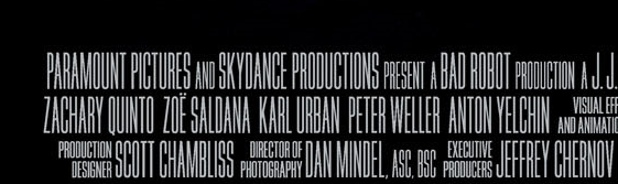
Popular Styles Used in Film Acknowledgments
When it comes to showcasing talent in films, the visual presentation plays a crucial role. The choice of typeface can set the tone, create mood, and even become iconic in its own right. Different styles bring unique flavors, whether they’re elegant scripts or bold, eye-catching designs. Let’s dive into some widely recognized choices that have graced the screens.
One classic option that has remained a favorite is the elegant Serif typography. Known for its timeless appeal, it adds a touch of sophistication and professionalism. Films often leverage this style to convey a sense of authority and tradition, making it particularly popular for period pieces or dramas.
On the other hand, Sans Serif alternatives provide a modern aesthetic that resonates with contemporary audiences. Their clean and unembellished lines create a sense of clarity, making them perfect for many genres, especially those targeting younger viewers. This style has become increasingly prevalent in various blockbuster hits.
Don’t overlook the playful nature of Script styles, which can infuse a sense of creativity and whimsy. Often used in romantic comedies and family films, these handwritten-like designs evoke warmth and personality, making the experience feel more personal and engaging.
Lastly, there’s the powerful impact of Display typefaces. Ideal for grabbing attention, these styles often feature unique shapes and bold elements, making them perfect for action-packed flicks or intense thrillers. Their striking nature ensures they stand out during the crucial moments of the presentation.
Each of these styles serves a particular purpose, enhancing the storytelling experience while honoring the hard work of everyone involved. Ultimately, the right choice can elevate the entire viewing journey, creating lasting impressions long after the credits roll.